Showing posts with label Excel. Show all posts

Monday, June 27, 2022

Using Excel to Tame Large Datasets


I teach various Microsoft software; Word, Publisher, PowerPoint, Access, and Excel.  Each has value in the workplace depending on the tasks that need to be completed.  Of the five, however, I find that intermediate to advanced knowledge of Access and Excel is like having money in the bank.   The ability to manage large data sets in this “age of data” is a crucial skill to develop.   In this posting, I will demonstrate how to use Excel to manage a dataset from the Federal Bureau of Investigation’s Uniform Crime Report.   The Uniform Crime Report is a list of offenses known to law enforcement that is reported by municipalities each year.  Part of the UCR is broken down by state, allowing users to select and download individual states for analysis.  In this example, I am using New Jersey’s 2010 UCR data. 
The dataset contains 493 cities and towns.  A complete record for each town is represented in the rows.  There are 12 categories of information including the city name and categories of crime.  These categories are contained in the columns.


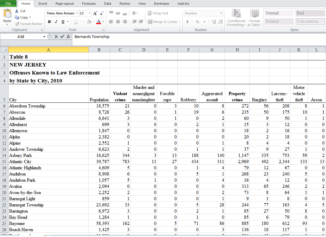
The first thing you may notice when attempting to browse the sheet is that it is quite easy to lose your place.  In the screenshot, what does the value 146 in cell H38 represent?  Of course I can scroll back and over to the beginning of the spreadsheet and find that the H column reflects property crime, and Row 38 reflects Bernards Township. 


An easy way to keep column headings and row labels in view all the time while scrolling the data is to use the freeze pane option.  In this example, the cells I want to freeze are located above and to the left of cell B6.  I highlight the cell, select View-> Freeze Panes-> Freeze Panes.  Now when I browse the sheet, the column headings and row labels stay in view. 


Even with the spreadsheet easier to scroll through, finding specific data can still be a cumbersome task.  For example, suppose I want to review crimes for New Jersey’s 4 most populated cities.  I could employ Excel’s Sort and Filter option by selecting the Population column and then selecting Sort & Filter.  I would have to repeat the steps to sort other categories.  A downside of this method is that it changes the layout of the spreadsheet.

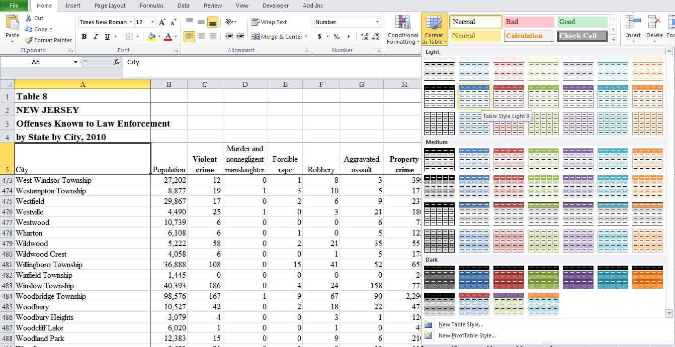
A better option for data management in this case format the data as a table.  I click on cell A5, select Format as Table, and select a color scheme.  The Format as Table dialog box appears.  I will have to change the data range from $A$1 to $A$5 since the actual data starts in cell A5.  I also have to check “my table has headers” since each column heading represents a category of data.  My data is formatted into a table with filter control boxes for each column.
Using the filter control boxes, I can perform specific searches based on data criteria.  For example, perhaps I want to see a list of cities where the violent crimes were 100 or lower.  I select the arrow in the violent crime column and select number filters.  Notice the number filtering option available.  I will use the less than or equal to filter.  I set the criteria as 100 and I am presented with a list of towns
and cities where the reported violent crimes were 100 or less. 


These results can then be sorted largest to smallest or smallest to largest. Another useful number filter is the Top 10 filter, although the title of this filter can be misleading. Not only can you filter for a top 10, you can also filter for the bottom 10, as well as change the min/max value and whether to search by items or percentages.  


When I demonstrate these techniques in class, many students assume that data is deleted.  However, filtering data hides those data that do not meet the criteria.  No data is deleted.   Removing the filter makes all data visible again.  A filter can be removed by clicking on the arrow in the column and selecting Select All.   


One of Excel’s most recognized user features is the software’s power of calculation, from basic mathematical functions to advanced statistical functions.  I like to convert data to tables whenever feasible because it allows me to append a total row to my table.  The total row gives me access to all of Excels functions with the click of the mouse.  By highlighting any cell in my table, selecting Table Tools and Design and clicking Total Row, a total row is added to the end of the table.  For example, summing the population column, I can see that the total population in this data set is 8,439,459.  While the SUM function is a commonly used tool, each column has a total cell with all of Excels functions available for use.      


Wednesday, May 5, 2021

A Tale of Two Analysis Programs: Excel and SPSS


Excel and SPSS (statistical packages for the social sciences) each have their strong points and weaknesses when it comes to data analysis and presentation.  In this example, I am going to use Excel and SPSS to help me demonstrate how crime increases and decreases through various months in Washington, D.C.  I am going to use the 2013 Crime Incidents csv file from the Washington, D.C. Office of the City Administrator available at: http://data.dc.gov/ .   After downloading the file, I open it with MS Excel and perform a “save-as” in order to save the csv file as a spreadsheet.  This will allow me to use formulas and better manage the data.  The first thing to realize about this dataset is that it contains 35152 records!  That is a lot of data to manage!
 

You can see that the report and time variable in column B is in the format mm/dd/yyyy  hh:mm.  Ideally, I would like a way to convert these dates to a three letter month abbreviation for ease of analysis.    Fortunately, Excel’s rich function library will allow me to perform the task.  I insert a column  to the right of column B, the REPORTDATETIME column.  I call the new column MONTHS.  In cell C2,  I use the following formula to convert the date/time format into the three letter date abbreviation:  =TEXT(B2, "mmm") where TEXT is the name of the function, B2 is the location of the data to be converted, and “mmm” represents the three letter abbreviation.  In a smaller dataset, I would simply copy the formula down using my mouse.  However with 35000 plus rows, the better solution is to highlight the cell containing the formula, move the mouse to the lower right hand side, and double click.  Doing so populates the entire column with the formula and results. 


My goal is to demonstrate how crime increases and decreases through the months.  While the spreadsheet contains a list of the months and a list of the reported offenses, it does not give me a count of reported offenses nor does it categorize the counts of crimes according to each month.  Excel does have PivotCharts for this purpose, but the process with this much data is cumbersome at best.  The easier solution, as we will see, is to import the data we need to analyze into SPSS.

SPSS allows users to import entire spreadsheets (both Excel and csv formats), text files, and MS Access files to name a few.  But for the purpose of this example, we only need to import two columns of data, the months column and the offense column.  The first thing I want to do is make sure I already have SPSS open and ready to use.  In Excel, I highlight each column, copy them, and paste the columns into SPSS.


I need to perform a little maintenance on the data I just pasted.  Row 1, containing MONTHS and OFFENSE must be cleared since these are labels, not variables.  In the SPSS Variable View window, I will use months and offense as labels to identify the variables.   The data is now ready for analysis.
 

SPSS allows a user to simply count variables, called frequency analysis in SPSS.  SPSS can be used to provide the counts or frequencies of the individual crimes and individual months as shown below.

      
However, one of SPSS strongest tools is crosstab analysis.  Crosstabing creates a table of summaries that shows how data interacts.  When we crosstab Months with Offenses, we can count the number of crimes committed in each month.  We can count individual categories of crimes for each month.  We can also count each category of crime for the year, all while viewing one table of data.  For example, in the month of February, there were 2234 total crimes reported.  Of these, 184 were burglaries.  And there were 3346 burglaries for the year.  

 
 As useful as SPSS is for performing numeric analysis and visualizing this analysis in organized tables, I find SPSS graphing functions to be a bit tedious when compared to Excel. Excel also produces better quality graphs that are more easily edited and enhanced for presentation.   Importing data from SPSS into Excel is a relatively easy process. I simply right click over the MONTH/OFFENSE crosstab and select copy.  I copy this data into a blank spreadsheet in Excel, making sure I use the paste special option so that the table maintains data integrity.


Creating a graph that demonstrates rate of crime through the months  is a matter of selecting the correct data and proper chart, in this case, months and total crimes for our data and a line chart as our display graph.   A couple of formatting edits of the chart and I am ready to discuss the data, which seems to show that crime increased from February on, and peaked in September.   


I can easily create an additional graph comparing numbers of the types of crime committed by selecting the crime labels, the totals for each label, and an appropriate pie chart. 


The charts can easily be used in a PowerPoint presentation or on a web site.  The ability to work with different software and move data from one tool to another is an easy and profitable skill to develop, and all it takes is a little practice.